Free Software – logo
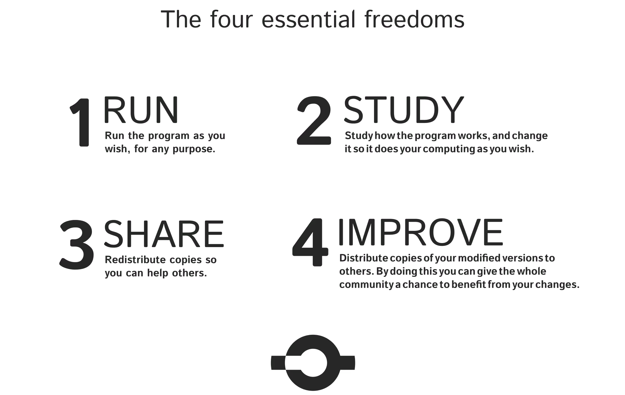
Free Software is the first battle in the liberation of cyberspace. It is about the freedom to control your computer yourself, not about price of software. Free how?
The Free Software Logo makes it easy to clearly brand any kind of software that is released under one of the many qualifying licenses.
As Free Software is an abstract concept, unsurprisingly its logo is neither self-explanatory nor does it convey an obvious meaning. In order to inspire possible interpretations, here are some of the ideas that lead to the final symbol:
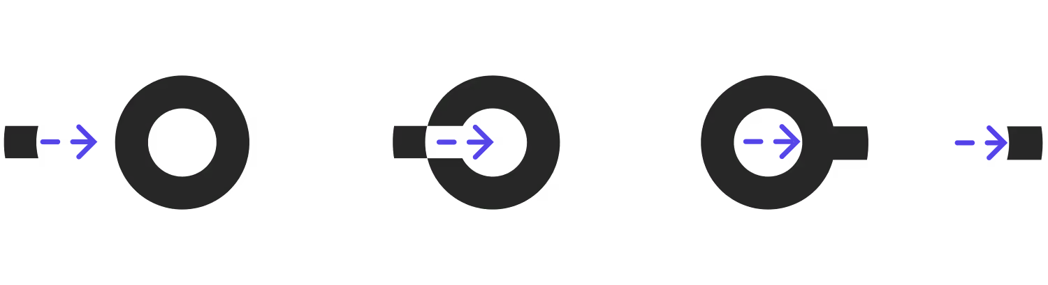
It tells the story of a single piece of software, entering and becoming part of the bigger free software circle, it then leaves that pool, on the other side, wandering off into the world, as a copy, not leaving the gap behind that it filled.
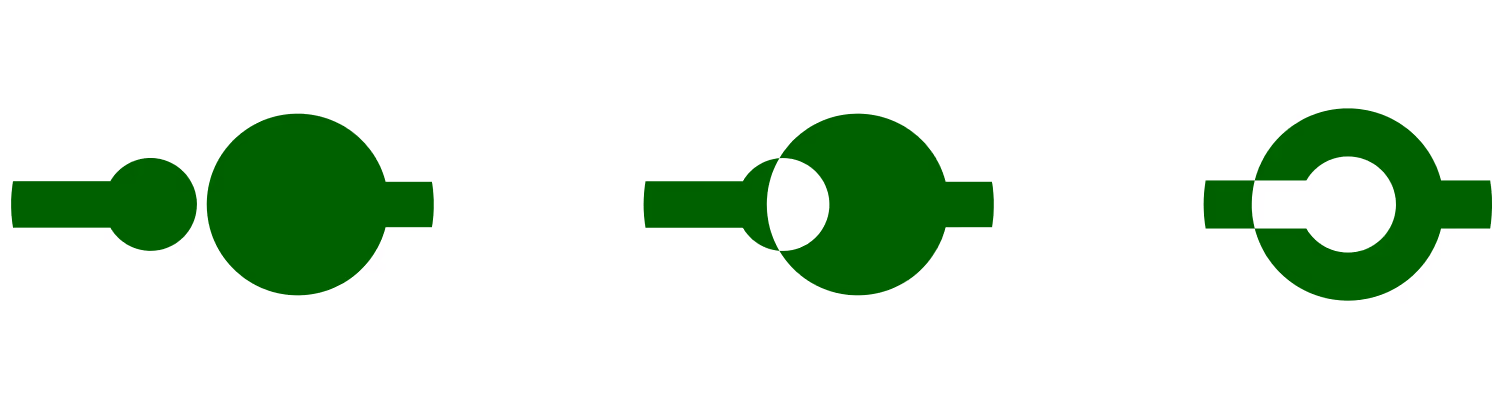
Geometrically it is interesting to note, how the logo shape emerges from overlapping a simple base shape: circle + prong. A resemblance of a copyleft "C", as well as a sideway "open source" keyhole can be found, but that isn't intentional.


